my designs.
Design Process and Research for DIGA3008
Published by Thoriso Samson on
I'll update this in a short bit, check back in later.
Update: I decided to go for a minimalistic design with my website. I'm thinking of choosing green as my primary color, perhaps different shades could work so there's enough contrast. I'm used to working with whites and blacks a lot so I'll find a way to implement them on the website. I'll have to find a 5th color so everything doesn't end up being as drab as some of my other sites, maybe I can include some kind of color switching mechanic as you scroll down.
wireframes
Below are possible markups of what my website could look like:
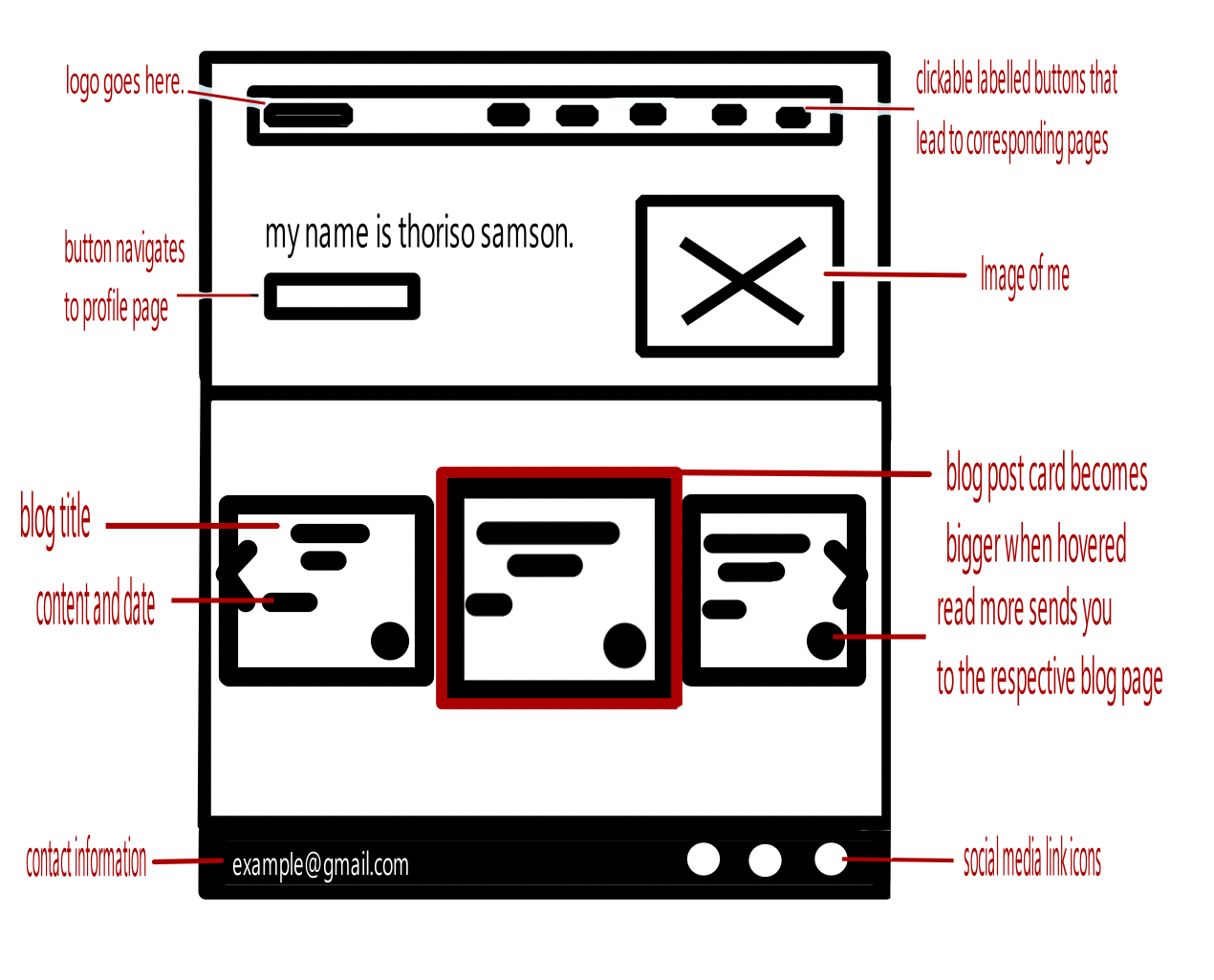
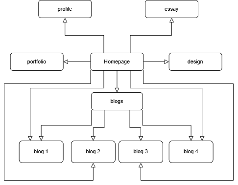
A picture detailing the root index.
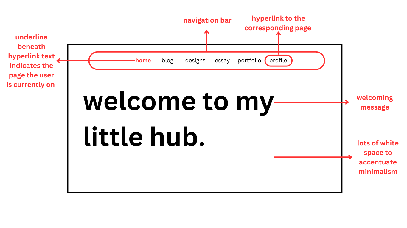
The homepage first section design mockup.
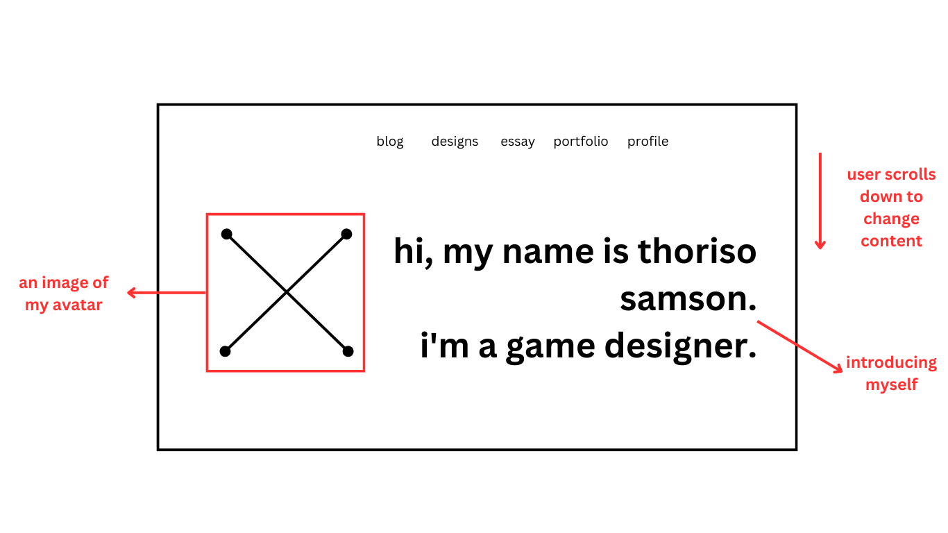
The homepage second section design mockup.
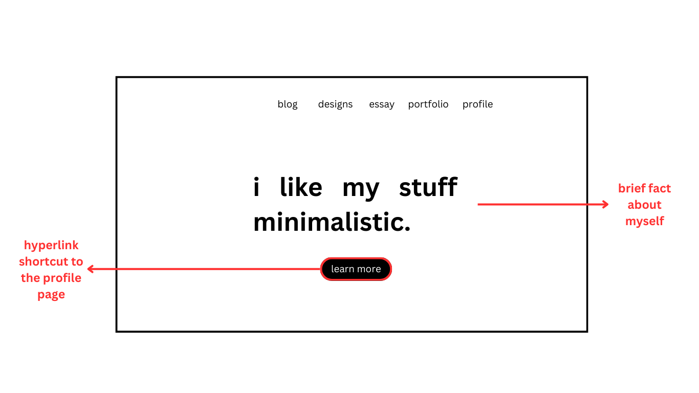
The homepage third section design mockup.
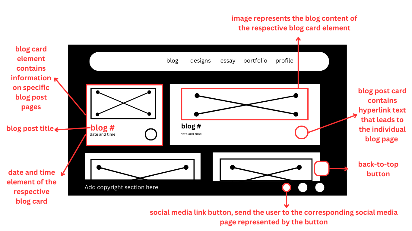
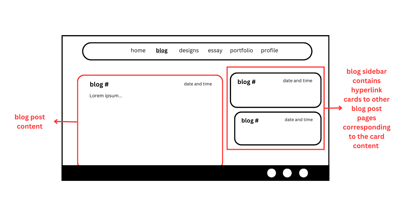
The blog section wireframe on the main page.
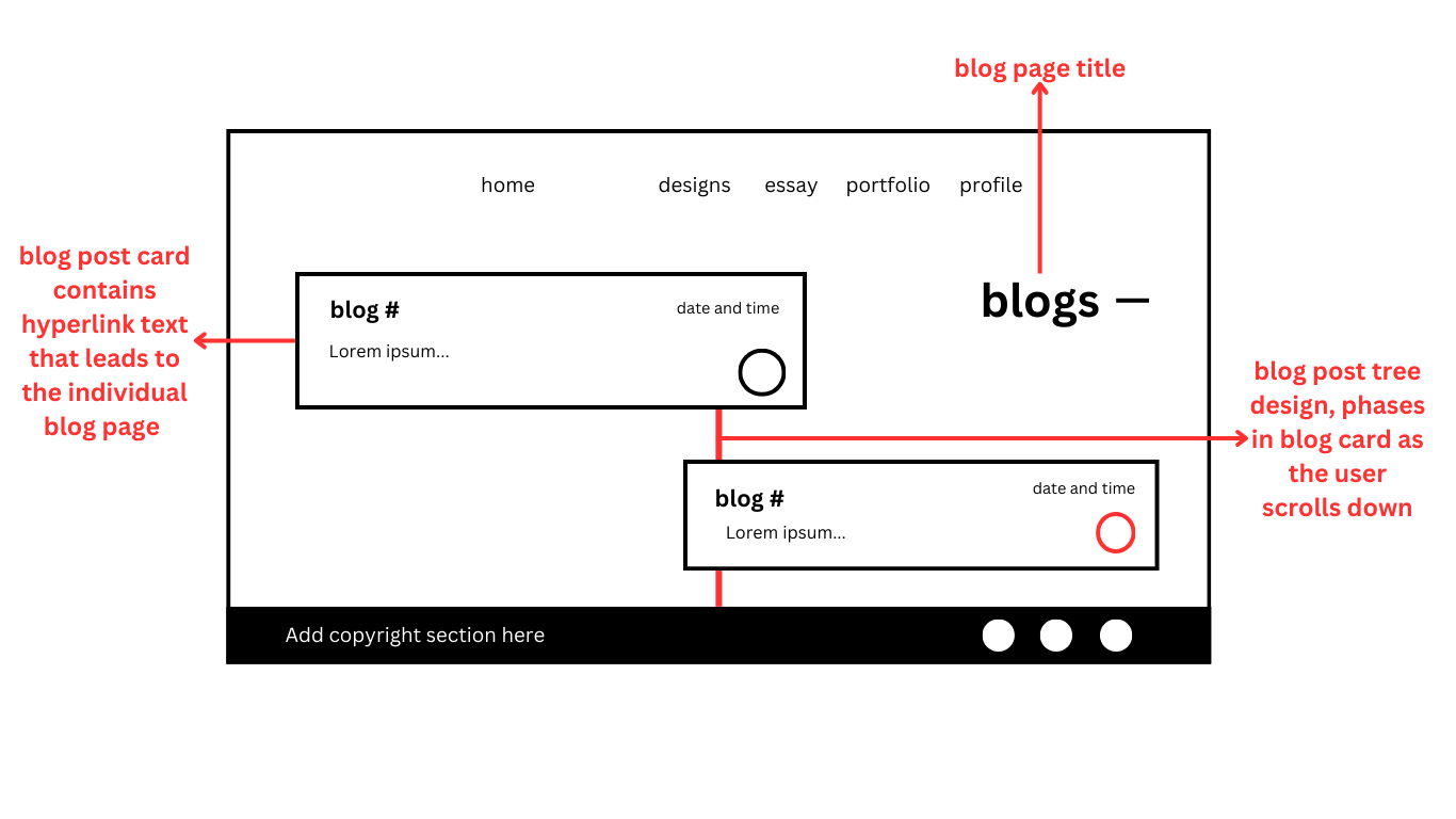
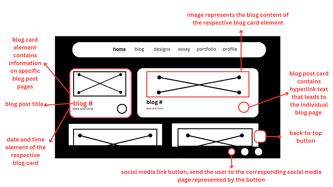
The blog index page wireframe.

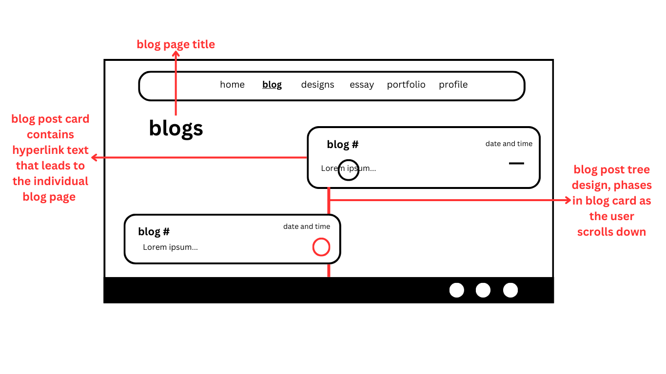
Individual blog post wireframe with mini navigation.
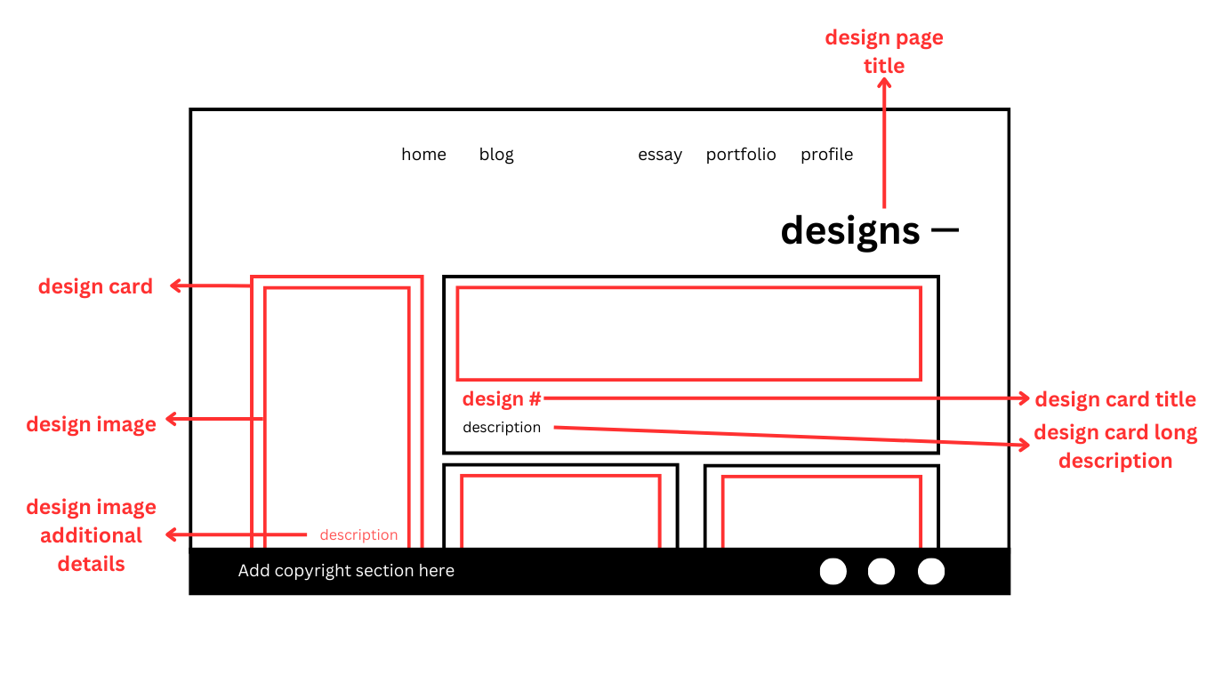
The design page wireframe.
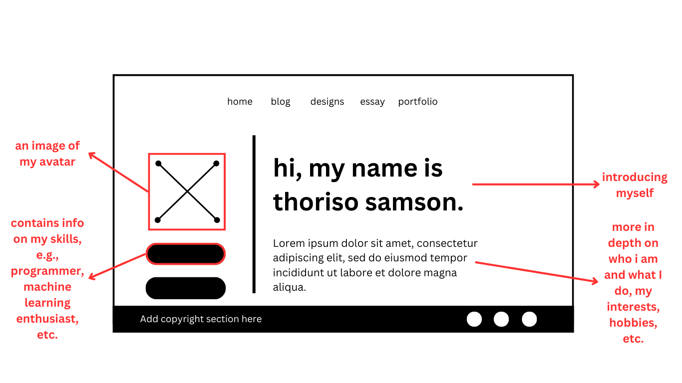
The profile page wireframe.
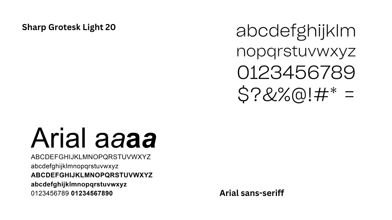
Typography for the website.
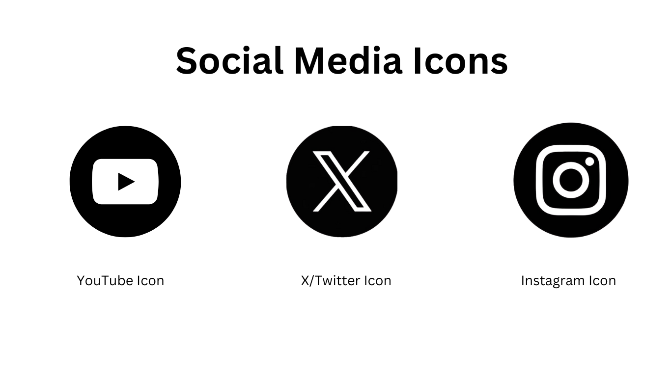
Social media icons for the website.
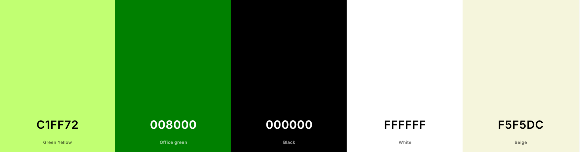
Style guide primary colors.
Week 5 - Design Section
Goal Alignment
My website is designed for gamers and tech enthusiasts who prefer neat, contemporary designs of websites such as Bandai Namco and Kojima Productions. Others that I used for reference were the Meta website and OrangeYouGlad. I plan to create an engaging and picture-filled experience with just enough text to attract viewers to the content without bogging them down.
The guiding principles behind my design are:
User Experience Consideration:
Integrate back-to-top links, smooth transitions, and intuitive navigation to reduce unneeded scrolling fatigue.
Tech-Centric Design:
Using a well-thought-out color scheme tied to color theory, presenting an even look that is natural for those accustomed to gaming and technology sector websites. I chose a green palette, I chose the color due to its having a strong association with coding in the contemporary tech space. The choice of minimalism was encouraged by the fact that a lot of companies from Silicon Valley seemed to be adopting that as of late.
Content Hierarchy:
My portfolio and blogs take center stage as they most aptly showcase my work while keeping the presentation neat for information transmission.
Information Structure - Content Mapping
Information is organised to prevent it from becoming cluttered yet remains as convenient as possible:
Homepage:
Initially planned to be a simple welcome page, I have redesigned it to have an introduction that features a preview of my blogs so that the users can interact at once without having to only rely on the navigation bar.
Navigation Bar:
Alphabetically ordered for convenience, to have all sections easily accessible.
Blogs:
Aggregated on a blog hub page where users can view abbreviated versions before reading full articles.
Design Page:
Holds wireframes and research results, aggregating content into categories without burdening the reader.
User Pathways:
Purposefully placed buttons and links lead users to the most relevant areas with fewer steps to navigate.
In respects to the font color, I may choose to use a gradient on some headings against a contrasting background of either black or white. I see this is a common occurrence on tech or gaming orientated website where some kind of gradient will be located on the screen whether it be in text or in the background itself. Through a combination of these tenets, my website aims to achieve an ideal blend of visual appeal and effectiveness without bombarding the user with too much information all at once, in a seamless and eye-catching browsing experience for my target users.
Social media icons for the website.
User Flow - Screens, Behavior, and Decisions
It directs users across the site with a guided flow that focuses on usability:
Entry Point (Homepage):
Users are introduced to my work with minimalism and the least distractions.
New text scrolls in with a dynamic appearance, keeping the user engaged.
Blog previews are a natural way into deep content.
Navigation & Interaction:
The navbar remains simple and super-responsive, optimised for desktop and mobile users.
Apart from the navbar, only my blog and profile pages have direct links for quick access.
Interactive buttons on blog cards encourage input in a non-intrusive manner.
Each page smoothly transitions to the next, reducing users' cognitive load.
Content Consumption:
Users navigate long-form blog pages with well-defined content to prevent information overload.
The "learn more" approach ensures that content remains bite-sized but leaves space for deep diving when necessary
Users looking for design details can link directly to relevant research and examples through an organised section.
List and Description of Interface Elements Chosen
Typography:
Roboto is employed for its clean, contemporary look that enhances readability alongside the technology-conscious theme.
Color Scheme:
Light Green (Background) – Produces a soft, clean background.
Black (Buttons & Text) – Offers high contrast for readability.
White (Task Bar) – Maintains a clean and sleek navigation experience.
Soft Green (Content Buttons) – Attracts attention to clickable elements without crowding the design.
Vivid Yellow (Navigation Highlight & Button Text) – Brings the attention to primary interactions and page indicators.
Button Interactions:
Buttons display light scaling, color transition, and box shadows as feedback.
Light border-radius yields a gentler feel in a bid to maintain the overall appearance.
Animations & Transitions
Smooth page transition abolishes jarring jumps, improving the browsing experience.
Interactive elements like blog cards and navbar menus simplify usability without distraction.
Additional Considerations Made
One of the changes I made later on was adjusting the border-radius of most elements to 25px. I found this visually appealing and more consistent with the style of my navbar. Additionally, I replaced the standard scrolling navbar with a sticky one, which felt more modern and user-friendly. Inspired by other websites, I also implemented a hamburger icon for mobile devices, along with a specialised mobile menu, something I wasn’t able to include in my previous submission.
While working on the essay page, I experimented with different layout styles I found online. I ended up incorporating some of those ideas because I liked how they looked. That design exploration actually influenced my decision to standardize the border radius site-wide. It also led to some updates in the blog section, though I still feel the look there isn’t fully optimised yet. I’ve retained the original color scheme and plan to gradually apply the new styles across the rest of the site.
In terms of functionality, I used JavaScript to toggle between a hamburger icon and an X icon when the mobile menu is opened. I’m also planning to use JavaScript to highlight the active page in the navbar by making its link bold and possibly adjusting its color to match my existing color swatches. That feature isn’t fully working yet, but it’s something I intend to get right soon. Overall, these updates are aimed at improving both the look and usability of the site across devices. Another thing which may be a minor change but I still found noteworthy enough to talk about is the exclusion of my fourth planned color from the overall website look. I was unable to find a suitable place to integrate it without making the website veer away from its established aesthetic.
The homepage third section design mockup but a reworked iteration.
The blog section reworked wireframe on the main page.
The blog index page wireframe reworked.